


Your Box of Jell-O Is Getting a Makeover
The brand is updating its logo for the first time in 10 years.

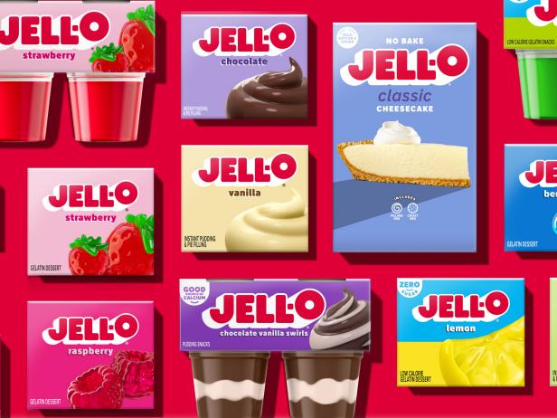
Photo courtesy of Jell-O
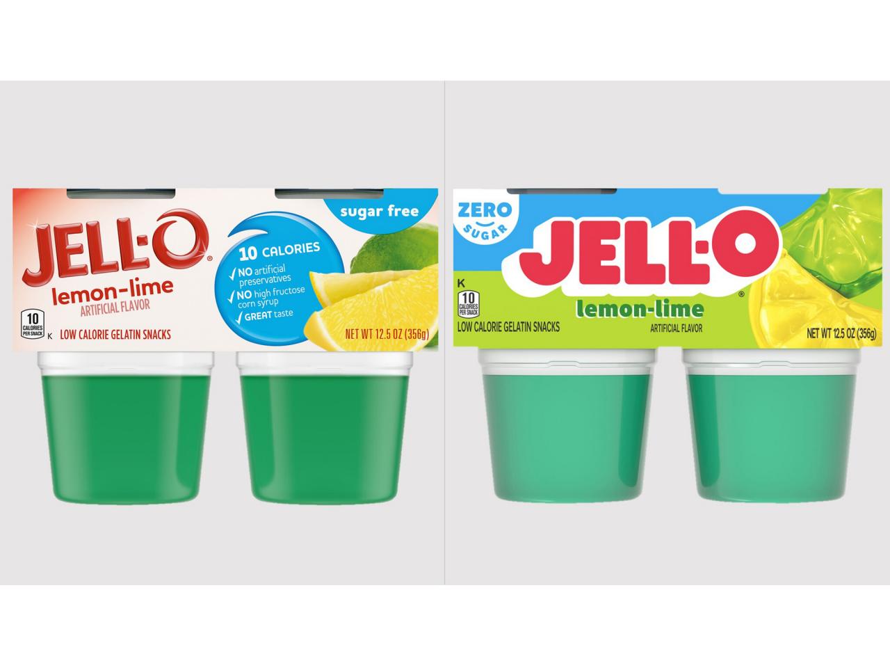
Whether you have fond memories of eating Jell-O as a kid or have recently seen the popular gelatinous dessert take over your ‘For You Page’ on TikTok, then you’ll want to listen up. For the first time in 10 years, Jell-O has switched up its packaging and logo for a fresh look.
The new logo, developed with Brand Opus, boasts a three-dimensional look with sleek lines and shadows. Jell-O intentionally put more emphasis on the “O” to highlight the possibilities when it comes to using this gelatinous ingredient whether that’s in a cottage cheese or fruit salad.

Photo courtesy of Jell-O
In addition to the logo, the brand has opted for slightly different packaging with more vibrant colors (think purple, pink, blue, orange and more) and images to depict how Jell-O can be used in the kitchen.
“After 10 years, it was time to take a look at our packaging and bring Jell-O into the future in a bold, playful, wonder-filled way,” says Kristina Hannant, Associate Director of Desserts at Kraft Heinz, in a press release.
The updated Jell-O packaging will be rolled out across the entire Jell-O portfolio from pudding to gelatin cups and boxes starting this July.
Related Content:

_s4x3.jpg.rend.hgtvcom.231.174.suffix/1593527568762.jpeg)


