


Do Handwritten Menus Make Us Think Food Is Healthier?
The author of a new study says typefaces that mimic handwriting connote 'love.'


Darren Baker, Photograph Darren Baker
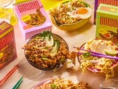
Most of us probably don’t think too much about the looks of the menus of the restaurants we eat at. We’re too busy deciding what we want to eat (and perhaps how much we’re willing to pay for it). But new research suggests a detail as frequently overlooked as the font in which the menus are printed may affect our emotions, judgments and even our behavior.
If a restaurant menu uses a typeface that mimics handwriting, diners are more likely to conclude that the items listed on it are healthier — better for them, using higher quality ingredients and made with greater care — according to a new study published in the Journal of Business Research.
“The handwritten typeface conveys love … that sense of human touch,” study co-author Stephanie Liu, an assistant professor of hospitality management at The Ohio State University, said in a university release. “It feels to the customer like there is more heart, more effort, and more love in it, even though it doesn’t cost any more money.”
The effect, however, holds only for restaurants already perceived as healthy.
“This wouldn’t apply to a fast-food brand that sells low-quality hamburgers,” Liu said.
Liu and her fellow researchers conducted two experiments using 185 participants, according to MarketWatch.com. In the first, researchers asked participants, ages 20 to 84, to pretend they were eating in a fictional restaurant called “Rilo’s Kitchen” that served foods featuring ingredients that were locally grown, non-GMO and free of antibiotics. Then half of them were handed menus a font that appeared machine-produced (Helvetica) and half in a font that mimics handwriting (DJB This is Me).
Afterward, both groups were asked a series of questions – and those who were given the handwritten menu tended to believe the food was healthier and said they were more like to take to social media to post about it. The results did not hold in the second experiment, in which participants were not told that the restaurant served fresh, local, seasonal dishes.
Liu’s theory is that the intrinsic organic quality of handwriting – with its irregularly written letters and words – and implicit implication of a personal touch subconsciously sends a message of warmth, effort and care. That extra effort something that we expect and value from a healthy restaurant, she suggests, but not so much a regular or fast food eatery.
Especially in the case of solo diners, that may help forge a sense of connection and prompt them to return.
The research was underwritten by the Marriott Foundation – so you may want to be on the lookout for handwritten fonts at your next hotel breakfast.
Photo: iStock
Related Links:


